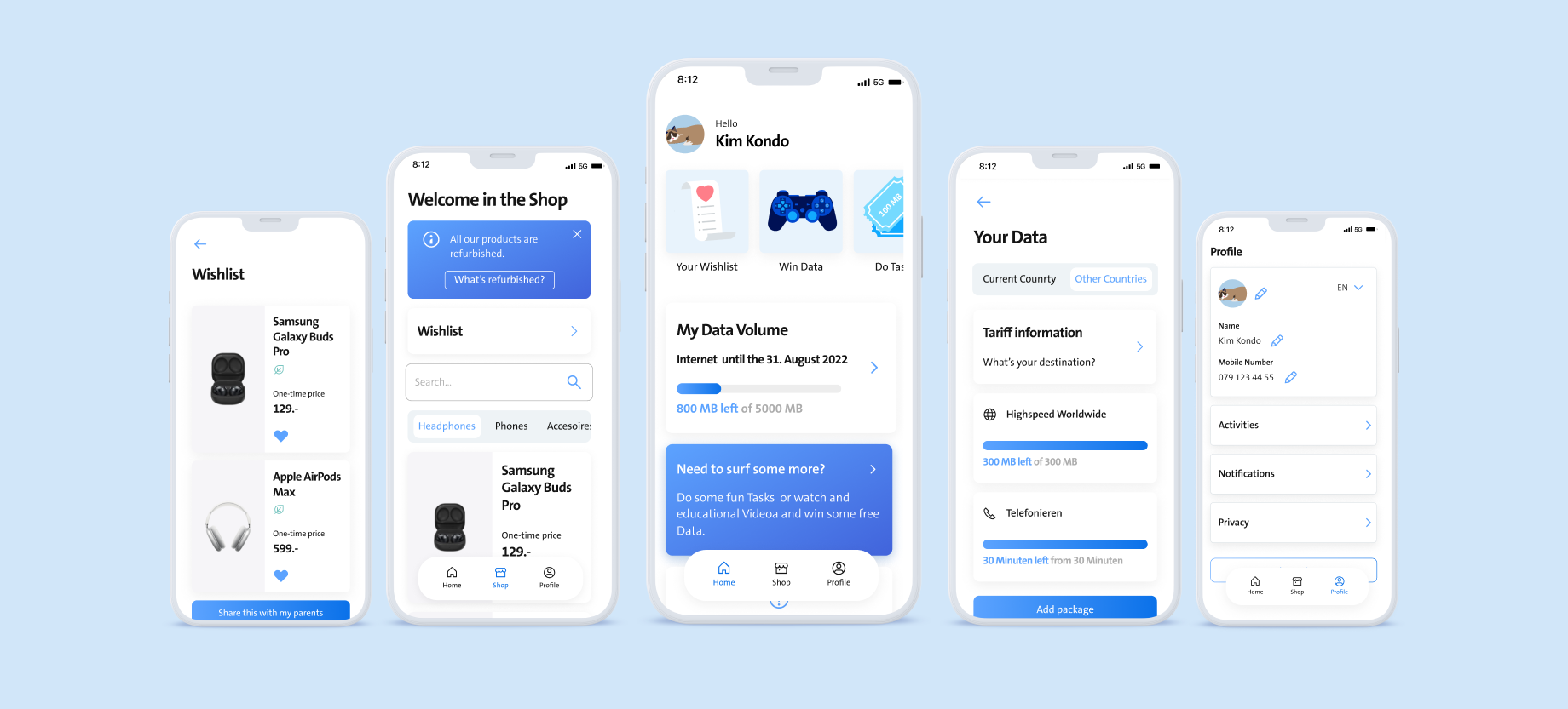
Young/Kids App

UI Design and Experience
Project overview
Additionally, to a soon-oncoming phone subscription for kids, we wanted to design a digital experience to guide them into the digital world. This app should resemble the "My Swisscom" app but give it a reduced, fresher feel.
See clickable Prototype
My contributions
I worked together with my co-workers on the early concept, wireframes, style guide, mockups, prototype, and Testing for this project.
The first thing that gives an impression of the app is the color. So it was the first thing we tackled.

Swisscom has already defined colors that we use in every design. These colors are a part of the "SDX" or "Swisscom digital experience".
Color styles
SDX styles
Colors from the Company Swisscom
We reduced the amount of colors and changed their hues a bit to make them seem lighter.
Young app styles
Array of new colors for the Design
The new colors and SDX Components were combined to create the "Young library". I also made the overall border radius bigger to make it more time-aware in design-trend terms.
Young library
Components + variants