My Swisscom Design Library

Component Library - Layout & Organisation (Figma)
Project overview
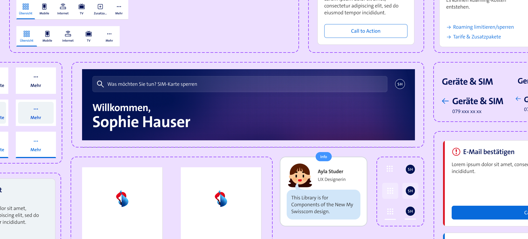
In preparation for the new My Swisscom redesign launch, I made a new component library for our design team to use on future features and stories. To ensure that our designs always use the same components.
My contributions
I selected, built, and organized the components for the new component library.
Not just customers should have a good user experience, designers should too. My key goal was to make a library that MY team would gladly work with – so communication and reviewing sessions with my team were crucial.
UX for designers
Research and testing
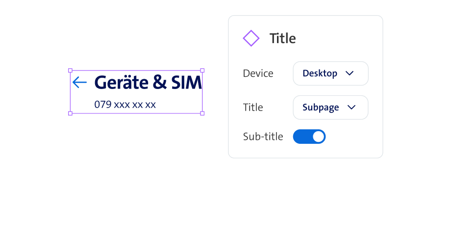
While building the components, I took advantage of Figma's great set of property options. To showcase the process here is a visualization of an easy example. This component is for all the titles on our My Swisscom pages. I gave it the "variant" of "title" with the values "Subpage" and "Hub". These values were then applied to the corresponding version of the design. Because the "Sub-title" is an optional element I allocated it a "Boolean-property" which lets you manage its visibility.
Creating components
Properties, booleans, variants
Because we design for mobile and desktop I added a second "variant" named "device". For this one, I added two values "desktop" and "mobile" which were allocated to the corresponding variant.
Devices (mobile, desktop)
When all is done and the library is published the fun part begins. Now the "instances" of the components can be easily used in the designs. I repeated this process for all of the components. I analyzed where which properties would make sense and reviewed it with my team.
Component instance
How it will look in the workflow